
As the UX Lead for a major insurance company's Employee Benefits (EB) team, I was responsible for designing user interfaces and interaction flows across multiple platforms supporting proposal, amendment, and renewal workflows (PAR), group onboarding, and administrative functions. These tools served as front-ends to large financial databases and were critical to the day-to-day operations of internal teams and external clients.
Problem: Existing group setup workflow was confusing and inefficient, requiring manual data transfer from multiple systems.
Solution: Designed new group setup workflow, consolidating existing data streams and UIs into a unified front-end experience.
Results: Setup time reduced by roughly 50% per new group.
Tools: Figma, Axure RP, Photoshop, Illustrator, UserTesting.com
Processes: Agile, process mapping, iterative wireframing, remote usability sessions
The purpose of the project was to design a software platform used by internal Employee Benefits (EB) users to manage benefits packages at the group level. In EB, groups are organizations that provide benefits to individual members (e.g., employees), but the details of what coverages each group provides are unique.
The business unit had already identified the need for a feature to set up new groups in the system to manage their requests and had drafted the basic requirements for what the new feature must accomplish, so the UX scope didn’t initially involve eliciting business or functional requirements. How it would align larger workflows, screen layout, and functional behaviors, however, was left to the designers to figure out.
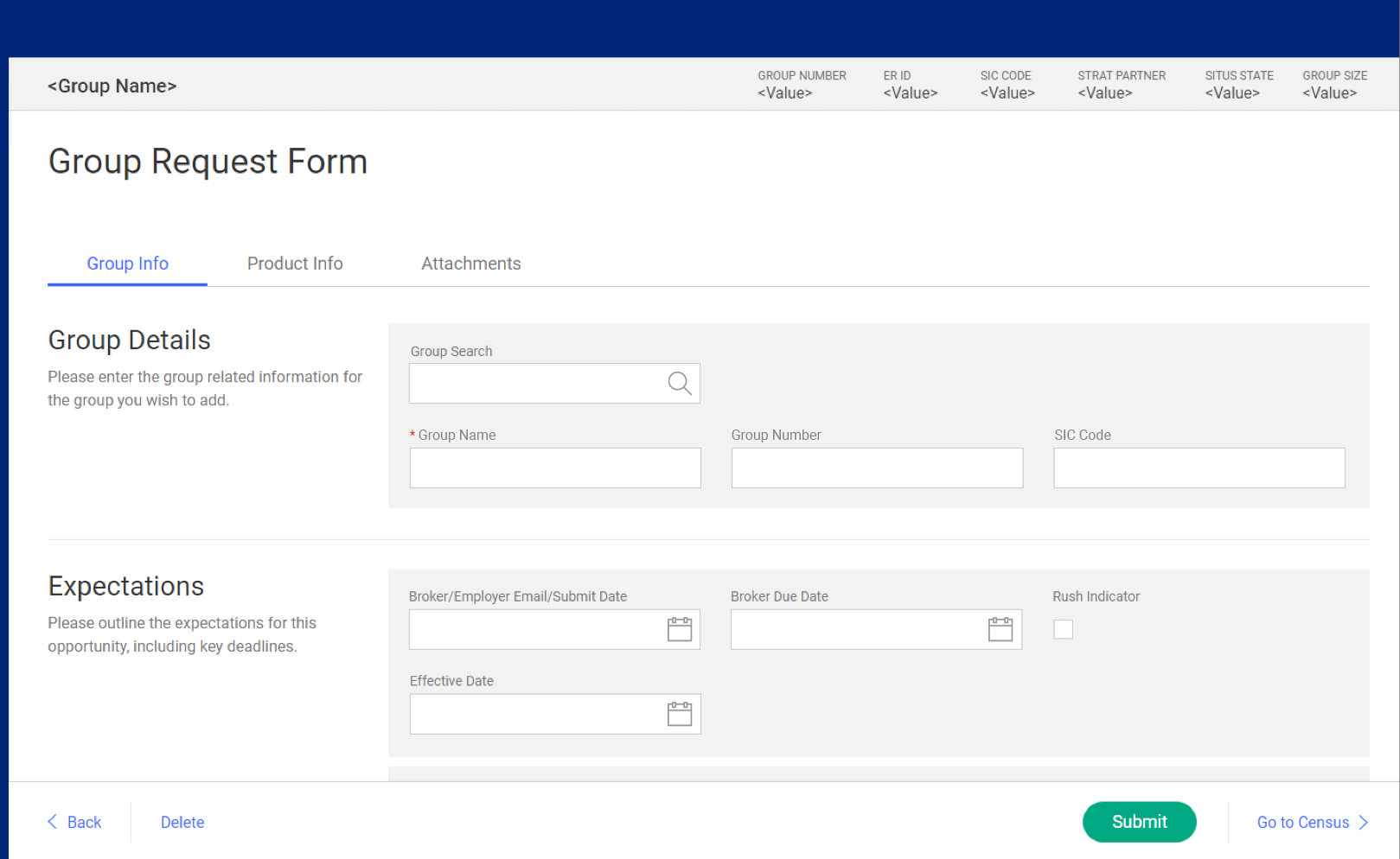
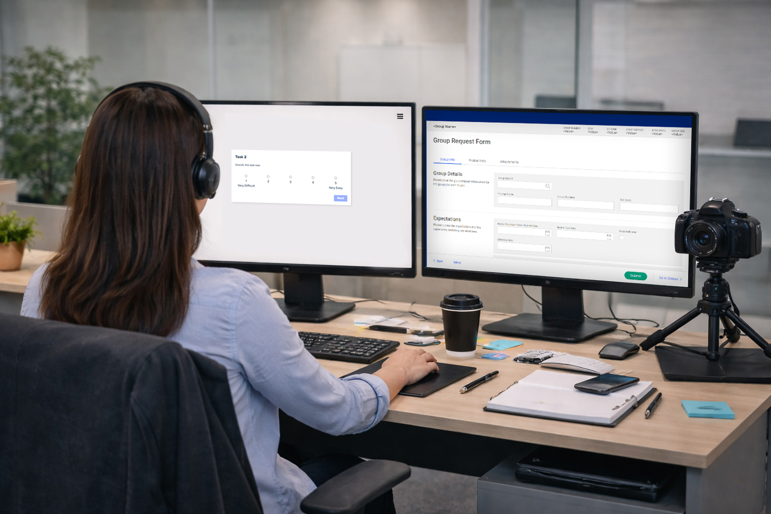
Employee Benefits Group Request form, high-fidelity wireframe.
The design and development of this project was executed using Agile methods. Requested features and capabilities had been initially added to the project backlog in the form of high-level user stories, but after reviewing the backlog with the various project stakeholders to understand technical feasibility, upstream/downstream dependencies, strategic alignment and a number of other factors, it became clear that most of the UX-related user stories needed to be revised and clarified since user research hadn’t been involved during the initial discovery and requirements definition phase. Many of the insights into user needs, preferences, and expectations that would guide my design decisions later in the project were gathered during this effort. While the overall strategic direction of the project had already been determined, the specifics around individual screens, interaction flow, information display, and editing preferences were guided by end user feedback that I gathered through interviews, observation, and lots and lots of questions...
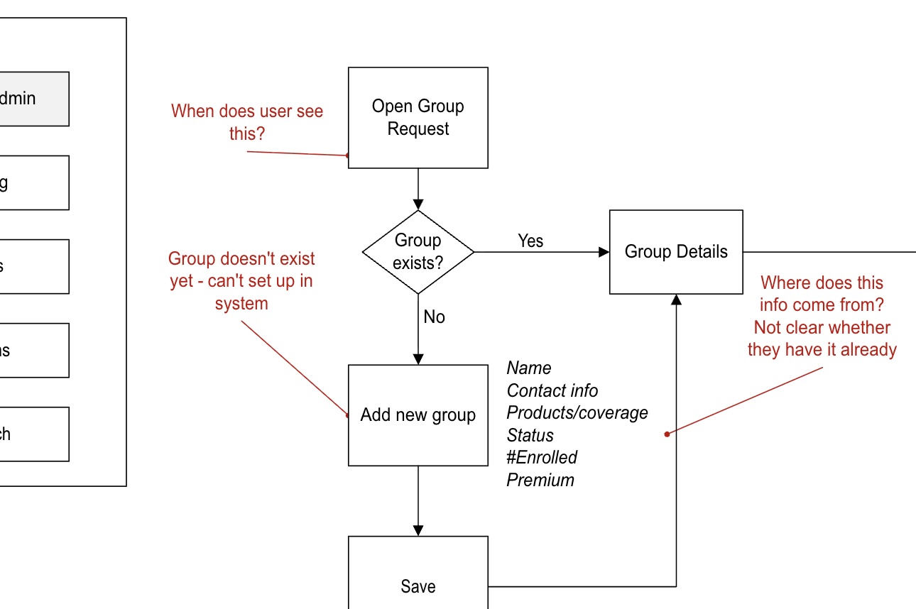
Gap became apparent once we started unpacking the user interaction flows.
A project like this one typically involves dozens of UX user stories—each user story is like an individual brick that, when stacked up, completes the entire wall. Basic screen setup and layout was one story. Each section within a data entry form was another. On some projects, even individual components might be assigned their own user stories, depending on complexity. In this project, once a “basic screen layout” user story for a particular requirement was committed to a sprint, I started off by sketching a variety of possible layout and functionality ideas on a whiteboard. Whiteboards are my favorite way of getting things started, because I can quickly gain feedback from other members of the project team, and in this case some of the actual end-users of the software since their desks were right down the hall. I like to use a portable whiteboard that I can physically carry from my desk to meeting rooms or other people’s desks to facilitate this sort of collaboration.
After working through a number of iterations of the basic layout and getting general agreement of the bast way forward, I prepared the initial low-fidelity wireframe. Although this helped stakeholders start to visualize how the final product might work, I needed to remind them that this isn’t what the final product will look like—it’s just a blueprint to show basic form and function, with visual treatment to come later. They identified a few gaps, and pointed out some areas where screen elements could be rearranged to better align with other tools that the end users are already familiar with. Once this initial wireframe was solid, I moved on to putting together an interactive prototype.

Whiteboard sketches help me quickly sketch out ideas and capture feedback.
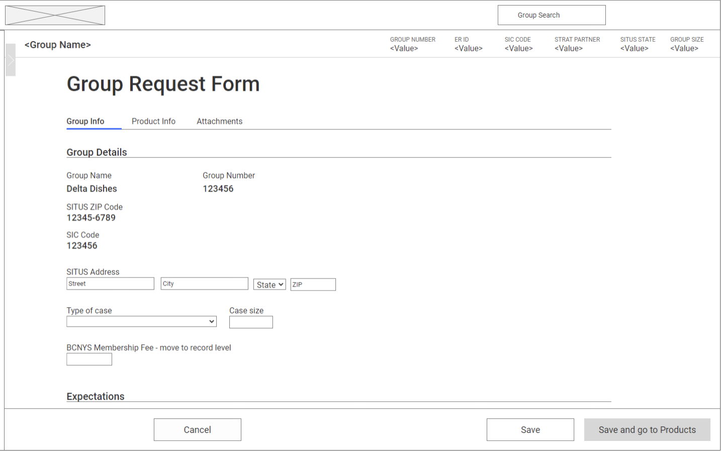
Low-fidelity wireframe derived from the sketching process.
Since the company has a fairly standardized set of components and design elements in its design system, I don’t spend much effort on mid or even high-fidelity wireframes for internal enterprise UX. Instead, I usually work out any issues in the low-fi wireframes, then move straight to an interactive prototype. With an interactive prototype, I can get much closer to simulating the actual feel of how an app will function, much more so than with static wireframes. This helps both project team members and stakeholders who need to make decisions and grant approvals, but also for end-users who can use the prototype in a usability test to uncover any issues there. While modern tools like Figma have some great capabilities (particularly for collaborative design and rapid AI generation of wireframes), I used Axure RP because of its native capability for simulating data-intensive apps commonly used in enterprise environments, complete with conditional variables and other scripting elements to manipulate test data. By using pre-built components from the design system’s component library, I was able to quickly put together the interactions needed to assess the viability of the design with a minimum of modification to accommodate the unique needs of the project.
Usability testing
Once the design was finished and approved, I packaged screenshots and artifacts from the design documents for use in the final project BRD, and for reference during UAT. Due to the collaborative and iterative nature of Agile project methods, the development team had been working with my design documentation all along in near real-time, so that handoff was more of an ongoing process than an event. The new experience wound up resulting in a roughly 50% reduction in time needed to set up a new group in the system.